

Learn the biggest editing mistakes I made on my way to 1000 subscribers and how you can avoid them for better audience retention rates.
Reaching 1000 subscribers on my YouTube channel was an exciting milestone, but it wasn’t without its challenges. Along the way, I made several editing mistakes that hurt my videos and audience retention.
In this blog post, I want to share these mistakes with you so you can avoid them and improve your own content.
1. Overcomplicating Edits

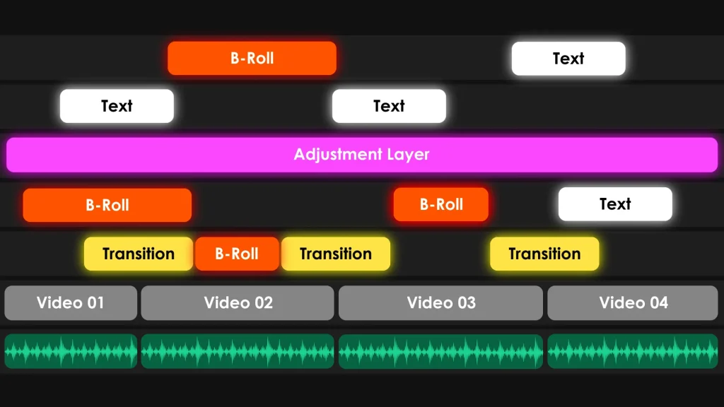
When I first started editing, I thought more was better – more effects, more transitions, more everything. I spent hours adding complicated effects to my videos, thinking it would make them stand out.
But in reality, it just made my videos look like every other retention-edited video on YouTube. Not to mention, it was a huge time sink. I quickly learned that simplicity is key.
Now, I focus on clean cuts and only use effects when they genuinely enhance the story. It saves me time and makes my videos look much more professional.
2. Using A Channel Intro
I used to start my videos with a long intro. I thought it looked professional, but in reality, it was just another barrier to entry.
Viewers want to get to the content quickly, and long intros can make them lose interest.
Instead of a 15-second animation, I start my videos with a HOOK and then jump straight into the content. This keeps the momentum going and holds the viewer’s attention right from the start.
This change made a noticeable difference in my audience retention. The stats don’t lie – viewers were more likely to stick around when I got straight to the content.

It’s a simple change but incredibly effective.
So, if you’re still using a long intro, consider trimming it down or cutting it out altogether. Get straight to the good stuff and keep your viewers engaged from the very beginning.
Remember, every second counts, especially at the start of your video.
3. Inconsistent Editing Style

Another mistake I made was having an inconsistent editing style.
In the beginning, I experimented a lot, which led to each video looking and feeling different. While it’s great to try new things, too much inconsistency can confuse your audience.
What helped me was creating a collection of templates and presets and sticking to them. This doesn’t mean you can’t evolve your style, but having a consistent approach helps build your brand identity.
To achieve this consistency, I downloaded Premiere Pro and After Effects templates and presets from Envato Elements. This included standard intro and outro sequences, transitions, animated texts, a fixed color grading preset, and font style.
These templates not only saved me time but also ensured that my videos had a uniform look and feel.
When viewers see your thumbnails and watch your videos, they should be able to recognize your style. This familiarity breeds loyalty and helps you stand out on a crowded platform like YouTube.
4. Neglecting The Importance of Thumbnails

Mistake number four is a big one.
For a long time, I didn’t put much effort into my thumbnails. I thought, ‘It’s the content that matters?’ But thumbnails are the first thing people see. If they aren’t eye-catching, people won’t click.
So, I started paying more attention to my thumbnails, making sure they were clear, bright, and attractive. A good thumbnail should tell viewers what your video is about and make them want to click.

Here are some things I learned along the way:
- Your thumbnail should be easily understandable at a glance, even on a small screen. Use large, readable fonts and avoid clutter. Keep the design simple but informative.
- Make it bright and colorful. Bright colors stand out more in the sea of thumbnails on YouTube. But be mindful of the balance – too much color can look cheap. Stick to a color scheme that matches your brand.
- Include a compelling image. Whether it’s your face with an expressive reaction or a relevant visual that represents your content. Faces are particularly effective because they create a personal connection.
- Consistency helps here too. Develop a style for your thumbnails so that they are easily recognizable as your content. This could be a specific layout, color scheme, or use of your logo.
Remember, your thumbnail is your first impression. It’s worth spending time to make it as appealing as possible. A great thumbnail can significantly increase your CTR (Clickthrough Rate), bringing more viewers to your videos.
5. Ignoring Audio Quality

Another big mistake was ignoring audio quality.
I thought viewers would forgive bad audio as long as the visuals were good. But I was wrong. Audio quality can make or break your video.
People would click away or leave comments about the poor audio, and it hurt my audience retention rate. So, I invested in a good microphone, added foam panels on my walls to reduce echo, and learned how to edit and process audio properly.
Improving my audio quality made a huge difference in viewer retention. Always remember, people will forgive bad visuals, but they won’t forgive bad audio.
6. Asking Viewers To Like And Subscribe Verbally

The next mistake I made was asking viewers to like and subscribe verbally either at the beginning or end of the video. People clicked on my video to get value from the content, not to hear a sales pitch.
Now I use a small animation that pops up in the middle saying ‘Like and Subscribe.’ It’s less intrusive and keeps the focus on the content.
If you’re wondering where to find such overlays, I recommend checking out Envato Elements. They have a great selection of animated overlays that you can use in your videos.
Since making this switch, I’ve noticed better viewer retention and more organic engagement. Viewers are more likely to like and subscribe when they feel it’s their choice rather than a pressured request.
7. Using Long End Screens

The last mistake I made was using long-end screens.
Earlier, I used to place a dedicated end screen that lasted 15 seconds at the end of my videos. This caused a sudden drop in viewer retention because people would click away as soon as the end screen appeared.
It was like signaling to my viewers that the video was over.
What I do now is end my videos sharply. I either place an end-screen video in the last 5 seconds or don’t use one at all.
By keeping the end screen short, viewers are more likely to stay engaged until the last second. This way, they get all the information I want to share.

Since making this change, my retention rates have improved, and more viewers are watching my videos all the way through. So, if you’re using long-end screens, try shortening them to the last 5 seconds and never let the viewers know that the show is over before it really is.